Aspen Counseling Clinic is a niche teletherapy clinic
based out of Colorado. They specialize in integration
healing, relationships, and making meaning for a variety
of adult clients from various walks of life.
based out of Colorado. They specialize in integration
healing, relationships, and making meaning for a variety
of adult clients from various walks of life.
ACC seeks to attract clients of a stable background who
wish to prioritize therapy and are willing to do the
difficult work to create positive change.
wish to prioritize therapy and are willing to do the
difficult work to create positive change.


Client
Aspen Counseling Clinic
Project needs
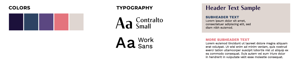
Brand identity, printed colleterial for business and advertising, web design that integrates with chosen CMS
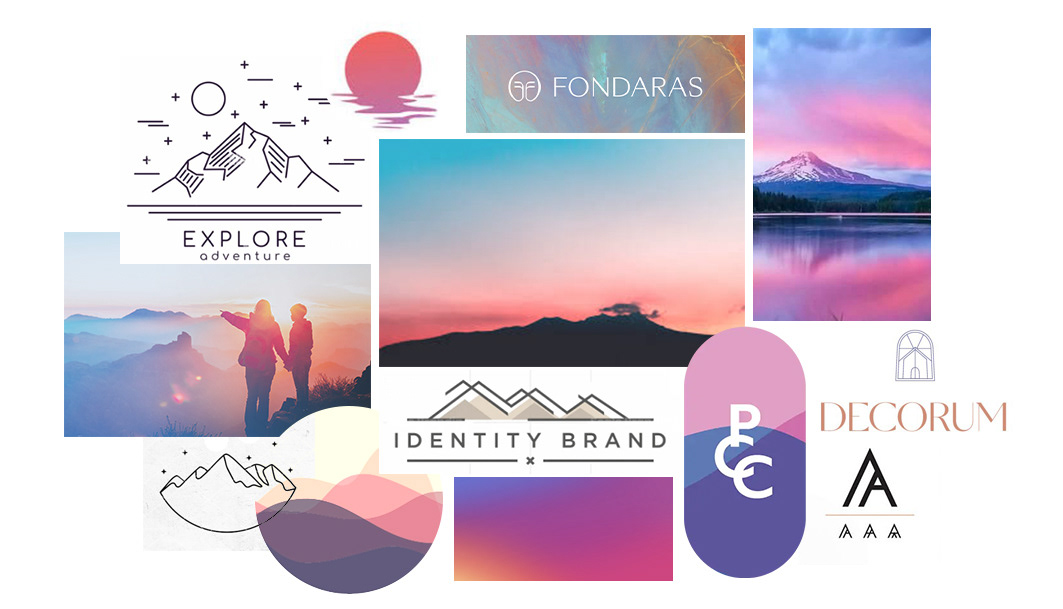
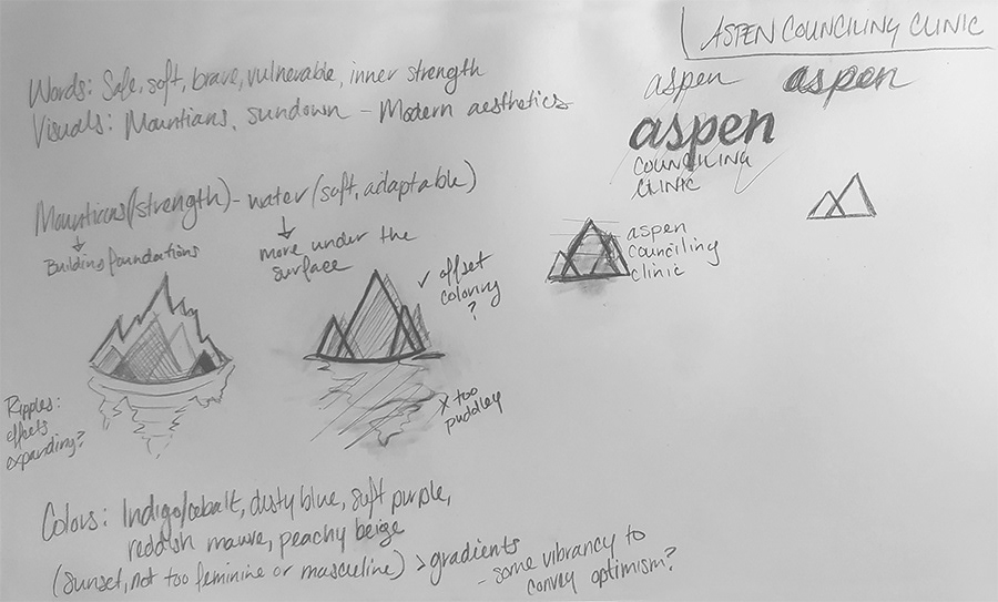
Moodboard + Concept Sketches
APPROACH
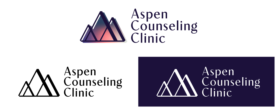
Focusing on an elevated and modern aesthetic, the typeface “Contralto” was chosen for its elegant but contemporary style. Inspired by the letterforms of the capitalized A from the selected typeface, a mountain face was built. This also connects the symbol to the typeface of the logo. These strong forms represent foundation and framework, and the bravery that a person has to begin to work on themselves. Multiple sizes are drawn to show that all kinds of people need healing.
The colors of the sunset were pulled from actual photography of Colorado mountains. The gradient is both modern, but also evokes a feeling of safety and comfort, the colors softly flowing into the outlined shapes. The colors are slightly offset - not perfect, and the white space on the face of the mountain gives the feeling of a “silver lining.”
Identity / Brand Mark